Covariance, Correlation and R-Squared Explained with Python

In data science and machine learning we often need to know the relationship between variables, or in this case, the relationship between numerical variables. Concepts like covariance, correlation and R-squared are useful but they are also interrelated. Knowing how they derived as well as knowing intuitively what the results of their calculations mean to a given problem can shed some light on the meaning, differences and relatedness of these statistical measures. We will also use python to dig into a dataset, perform some calculations and plot some results.
Review
Let’s review some statistical measures common in descriptive statistics that will help us with our exploration of the relationship measures we are interested in. Note that we will be using mathematical formulas from the sample perspective since we are literally taking a sample of the dataset you will see in the next section. Whether we are using population or sample formulas, its the intuition that is most important.
Formula For a Line
A line is defined by the following formula where m is the slope and b is the y-intercept. For a line, m is constant since the rate of change for a line is constant. And of course b is constant as well since you can only cross the y-axis once.

This image describes rise over run and we can tell that the y-intercept would be negative here in this example.

Mean
The mean is probably a measure everyone is familiar with. Its one of the measures of representing the center of a variable’s distribution (median, mode are the others).

Variance
Looking at the below formula right away you think we are taking some sort of average, right? Spot on! We are taking the average of the squared differences from the mean. The more observations you have far from the mean, or the more “outliers” you have, the higher that top term would be, thus the higher the variance. That should make intuitive sense.

So why do we square this? We don’t want negative differences to cancel out positive differences when measuring variability. Additionally, squaring amplifies large differences. For example, a difference of 2 squared is 4 but a difference of 10 squared is 100. Variance unfortunately is hard to make sense of since the unit is squared. For example if your variable is housing prices in dollars, squared dollars doesn’t make a whole lotta sense. That is where standard deviation comes in.
Standard Deviation
This measure if the most common measure of variability when it comes to descriptive statistics. Simply take the square root of the variance to get back to the unit of the variable. The higher the standard deviation, the more spread out your distribution is.
For example, which array below would you expect to have a higher variance and standard deviation? Clearly arr2, right?
import numpy as np
arr1 = np.array([1,5,10,40,100])
arr2 = np.array([1,10,50,60,200])
print('ARR1 VAR: ', round(np.var(arr1),2), '   ARR1 STD: ', round(np.std(arr1),2))
print('ARR2 VAR: ', round(np.var(arr2),2) , '   ARR2 STD: ', round(np.std(arr2),2))### OUTPUT
"""
ARR1 VAR:  1371.76    ARR1 STD:  37.04
ARR2 VAR:  5118.56    ARR2 STD:  71.54
"""
The Dataset
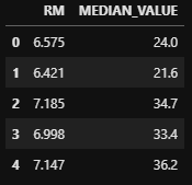
So let’s use the Boston housing dataset available in sklearn. We will look at the average number of rooms RM vs the median house value MEDIAN_VALUE measured in 100s. The MEDIAN_VALUE will be our dependent variable which will become more important when discussing R-Squared. We will only look at 100 data points.
import pandas as pd
from sklearn.datasets import load_bostonboston = load_boston()
df = pd.DataFrame(boston.data)
df.columns = boston.feature_names
df['MEDIAN_VALUE'] = pd.Series(boston.target)
df = df[['RM', 'MEDIAN_VALUE']]
df = df.head(100)
df.head()
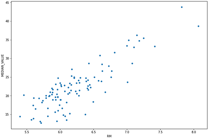
Looking at the scatter plot of these two variables we clearly see a linear relationship. I think this is a good starting point for our dataset seeing we clearly have a linear relationship of some sort. This will help us when looking at how covariance, correlation and R-squared apply to our two variables and what they can tell us about their relationship.
Covariance
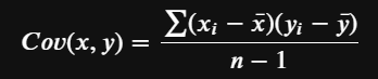
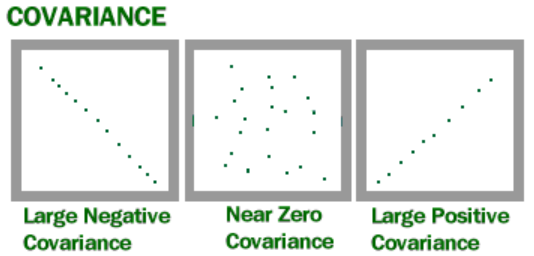
The covariance of two variables measures how linearly related they are. A positive covariance would indicate a positive linear relationship between the variables, and a negative covariance would indicate the opposite. When we say positive, we mean the slope is positive. The prefix co- and the word variance is a good indicator of what this measure seeks to accomplish. It tries to answer the question — how do the two variables vary (variance) together (co). And this looks similar to variance except we are dealing with two variables, and we are not squaring the terms in the numerator since direction is important.
Covariance is unbounded, meaning it doesn’t have a positive or negative cap. It is also sensitive to the scale of values in each of the variables. But how do we interpret the results anyways? As the below image shows, a positive value means that there is some positive slope relationship between the variables, meaning as one increases the other increases. A negative value means there is some negative slope relationship, meaning as one variable increases the other tends to decrease. When the value is near zero then there is no relationship between the two variables. The greater the magnitude the greater the strength of the positive or negative relationship.
Here we calculate the covariance of our two variables with python. It is a positive value which seems to match our scatter plot. If our scatter plot was a bit firmer towards a line then we could see that this number would be larger. Since covariance is unbounded and dependent upon the scales of the variables, how do we really know the strength of the relationship? Is there a better way to quantify the relationship that would make more sense? This is where correlation comes into play.
df['RM'].cov(df['MEDIAN_VALUE'])### OUTPUT 2.4630578888888897
Correlation (Pearson)
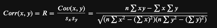
A magical thing happens when we divide covariance by the product of the standard deviations for our variables. The possible values from this formula range for -1 to 1, which is a beautiful thing compared to the unbounded covariance. Below we have the Pearson Correlation.
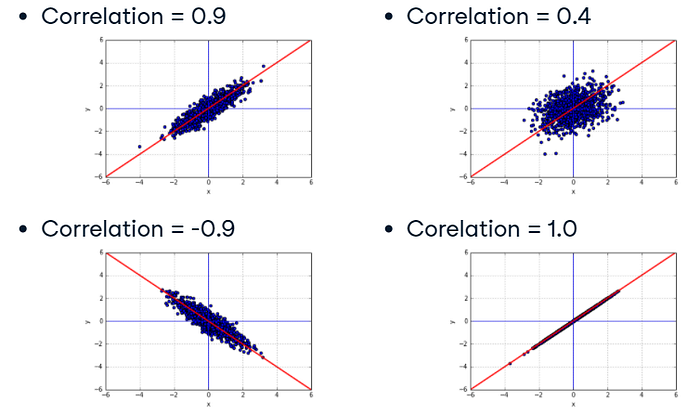
Much like covariance, the relationship direction is determined by the sign of the value and the strength by the magnitude. A value closer to -1 would indicate a strong negative relationship between the two variables. A value closer to 1 would indicate a strong positive relationship. And a value near or at 0 would indicate no relationship.
Something to note here is that if two variables are correlated it does not mean that one variable causes the change in another variable. Correlation measures the relationships between the variables and that’s it. Causation could be a possible explanation for the correlation but there could be other factors that lead to the relationship as well. For example, the max daily temperatures in Boston could show correlation to daily super market sales in Moscow. There would be no reason to believe that the change in one had caused the change in the other.
Now let’s calculate correlation with python. For fun this time let’s write our own function and then we can use pandas. See below for the implementation.
def corr(x, y):
    n = len(x)
    top_term = n*np.sum(x*y) - np.sum(x)*np.sum(y)
    term1 = n*np.sum(x**2)-np.sum(x)**2
    term2 = n*np.sum(y**2)-np.sum(y)**2
    bottom_term = np.sqrt(term1*term2)
    return round(top_term/bottom_term,5)corr_value = corr(df['RM'], df['MEDIAN_VALUE'])
print(corr_value)
round(df['RM'].corr(df['MEDIAN_VALUE']),5) == corr_value### OUTPUT
"""
0.84651
True
"""
Look at that! Our implementation equals pandas corr() method, and a high positive correlation value means there is a strong positive linear relationship between the two variables. With the scale now being -1 to 1, it is far more intuitive than covariance.
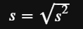
R-Squared
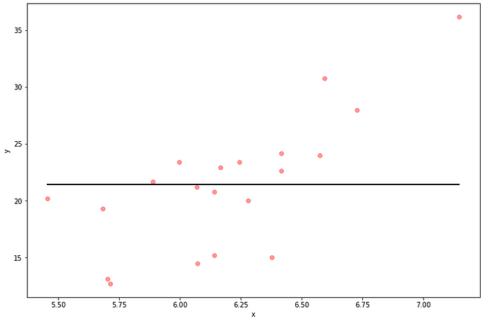
To get R-squared all we need to do is square correlation, but this doesn’t give us a ton of intuition. We now have a positive measure that varies between 0 and 1. R-Squared is often used to measure the quality of fit of a regression line to the data. Let’s start with an example. Let’s pretend we are just going to use the mean of y as a regression line to our data where the dependent variable y is MEDIAN_VALUE. RM is the independent variable. Let’s see what that looks like and what the resulting correlation and R-squared is. We are going to start out with intuition before diving into the formulas and strict meaning. And we will use numpy to calculate correlation and R-squared initially.
Let’s create training and test sets. Rather than actually performing regression right now we are going to consider the mean of y (MEDIAN_VALUE) as the predictions on the test set. Here we take a look at the correlation between our y variable and our fabricated regression line. As expected correlation is just about zero (actually slightly negative) and R-Squared is also just about zero. This regression line is clearly a bad fit but its going to give us insight along the way.
from sklearn.model_selection import train_test_split
import matplotlib.pyplot as plt
%matplotlib inlinedef measures(y1,y2):
    corr_val = np.corrcoef(y1,y2)[0,1]
    r_squared = corr_val**2
    return corr_val, r_squareddef plot_reg(x,y,pred):
    fig, ax = plt.subplots(figsize=(12,8))
    ax.scatter(x, y,color='r', alpha=.4) # actual data
    ax.plot(x, pred ,color='k') # regression line
    ax.set_xlabel('x')
    ax.set_ylabel('y')
    plt.show()train_set, test_set = train_test_split(df, test_size=0.2, random_state=42)
X = train_set[['RM']]
y = train_set['MEDIAN_VALUE']
X_test = test_set[['RM']]
y_test = test_set['MEDIAN_VALUE']y_pred_mean = np.array([y_test.mean() for i in y_test ])
plot_reg(X_test, y_test, y_pred_mean)
corr_val, r_squared = measures(y_pred_mean, y_test)
print('CORR: ', corr_val)
print('R-SQUARED: ', r_squared)## OUTPUT
"""
CORR:  -1.7045225113916206e-16
R-SQUARED:  2.9053969918407975e-32
"""
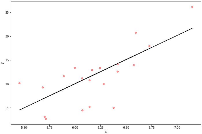
Now Let’s actually perform linear regression and see what happens. We will train it using the training data and then we will predict on the test data. We see below that correlation and R-squared are much higher. The correlation between the predicted values and the actual values is .73 indicating a strong positive relationship. The R-squared value is .53 which is certainly higher than what we had before but what does that really mean?
from sklearn.linear_model import LinearRegressionreg = LinearRegression().fit(X,y)
y_pred = reg.predict(X_test)plot_reg(X_test, y_test, y_pred)
corr_val, r_squared =measures(y_pred, y_test)
print('CORR: ', corr_val)
print('R-SQUARED: ', r_squared)## OUTPUT
"""
CORR:  0.7328981184948362
R-SQUARED:  0.537139652093271
"""
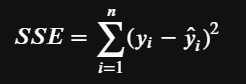
When we considered the mean to be our predictions we clearly had a poor fit. The sum of squared residuals could give us some insight into this. Let’s call this SSE (error sum of squares) which is formally defined as the sum of the squared residuals between the regression line and the actual data points. It gives us a measure of the unexplained variability by the regression line.
So this means that by improving our regression we eliminated prediction error and we have a much better fit.
SSE_bad = np.sum((y_test-y_pred_mean)**2)
SSE_good = np.sum((y_test-y_pred)**2)
print('SSE OF BAD LINE: ', SSE_bad)
print('SSE OF GOOD LINE: ', SSE_good)### OUTPUT
"""
SSE OF BAD LINE:  657.0680000000001
SSE OF GOOD LINE:  310.15461476984484
"""
Now let’s define SST (total sum of squares) as the dispersion of the actual y data around its mean. This gives us the total variability of y.

In our problem we already calculated this via the SSE on the bad regression line where we fabricated it to be just the mean. So if we take the ratio of SSE to SST we get the error ratio. Clearly the ratio is 1 for the bad fit but its only .47 for the good fit. And we also noticed previously that R-squared went up from our bad fit to our good fit. I think we are starting to see what R-squared is.
SST = np.sum((y_test-y_test.mean())**2)
error_ratio_bad =  SSE_bad/SST
error_ratio_good = SSE_good/SST
print('ERROR RATIO OF BAD LINE: ',error_ratio_bad)
print('ERROR RATIO OF GOOD LINE: ', error_ratio_good)## OUTPUT
"""
ERROR RATIO OF BAD LINE:  1.0
ERROR RATIO OF GOOD LINE:  0.47202818394723955
"""
So if the error ratio we calculated tells us how much the fitted line DOESN’T explain the variability in y then 1 minus this ratio must tell us something different. It actually tells us what proportion of the variability in y is indeed explained by the model. So if SSE/SST is 1 then 1–1=0 means that the model doesn’t explain any of the variability in y. If SSE/SST is 0 then 1–0=1 means that the model completely explains the variability in y. This is the definition of R-squared.
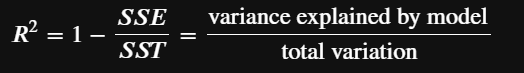
R-squared ranges between 0 and 1 and is usually represented as a percentage. When R-squared is somewhere between 0% and 100% it means that there is some SSE but the model does have some level of fit to the data. The higher R-squared is the higher the proportion of y’s variability the model explains.
So in summary, R-squared tells us what percent of the variability in the dependent variable is accounted for by the regression on the independent variable. In general, R-squared is usually represented as a percentage and is a measure of how good a fit the regression line is.
Here we replicate the answers we got using numpy but this time we calculate it by using the previous steps where we defines SST and SSE.
R_squared_bad = (SST-SSE_bad)/SST
R_squared_good = (SST-SSE_good)/SST
print('ERROR RATIO OF BAD LINE: ',R_squared_bad)
print('ERROR RATIO OF GOOD LINE: ', R_squared_good)### OUTPUT
"""
ERROR RATIO OF BAD LINE:  0.0
ERROR RATIO OF GOOD LINE:  0.5279718160527604
"""
Conclusion
From covariance on down we see the relatedness of these statistical measures and we also see some of their differences. I hope that this post was enlightening for you in that it would give you some level of comfort and intuition when these terms come up in your study or work.